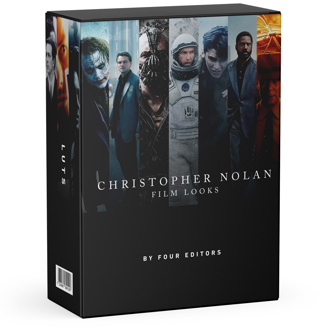
Christopher Nolan Film LUTS

Transform your videos with our exclusive Christopher Nolan LUTS and elevate your editing game with stunning cinematic color grading. Just one click and boom, that perfect look!
How many unique LUTS are included?
300+ .cubes files are included. Each film category has 40 different color grading LUTS based on different scenes from the film
Can I use this for every project?
Yes, of course you can. Would it not be weird if you would not be allowed to? Creating awesome videos with our assets is what we are here for. There is also a commercial license included with your purchase.
Which films did you make this LUTS from?
Tenet, Batman, Oppenheimer, Inception, Interstellar and Dunkirk. Scroll down for some previews.
Tenet
The color grading in Tenet is a visual masterpiece, characterized by its innovative use of inverted colors to distinguish between two different timelines, creating a visually and conceptually unique cinematic experience.

Before

After
Batman
In The Batman, the color grading stands out through its meticulous attention to detail and tonal control. The film employs a predominantly desaturated and moody color palette, with a focus on deep blacks and subdued (red) highlights, creating a dark and gritty atmosphere that complements the film's noir-inspired aesthetics. The use of high dynamic range (HDR) technology further enhances the depth and contrast, ensuring that every shadow and highlight is intricately rendered.

Before

After
Oppenheimer
In Oppenheimer, the color grading takes a historical and period-specific approach, capturing the essence of the mid-20th century. The film's color grading is characterized by a muted, vintage look that replicates the color technology of the era. It embraces a subtle, desaturated palette with an emphasis on earthy tones and pastel shades, transporting viewers back in time and immersing them in the ambiance of the World War II and post-war eras.
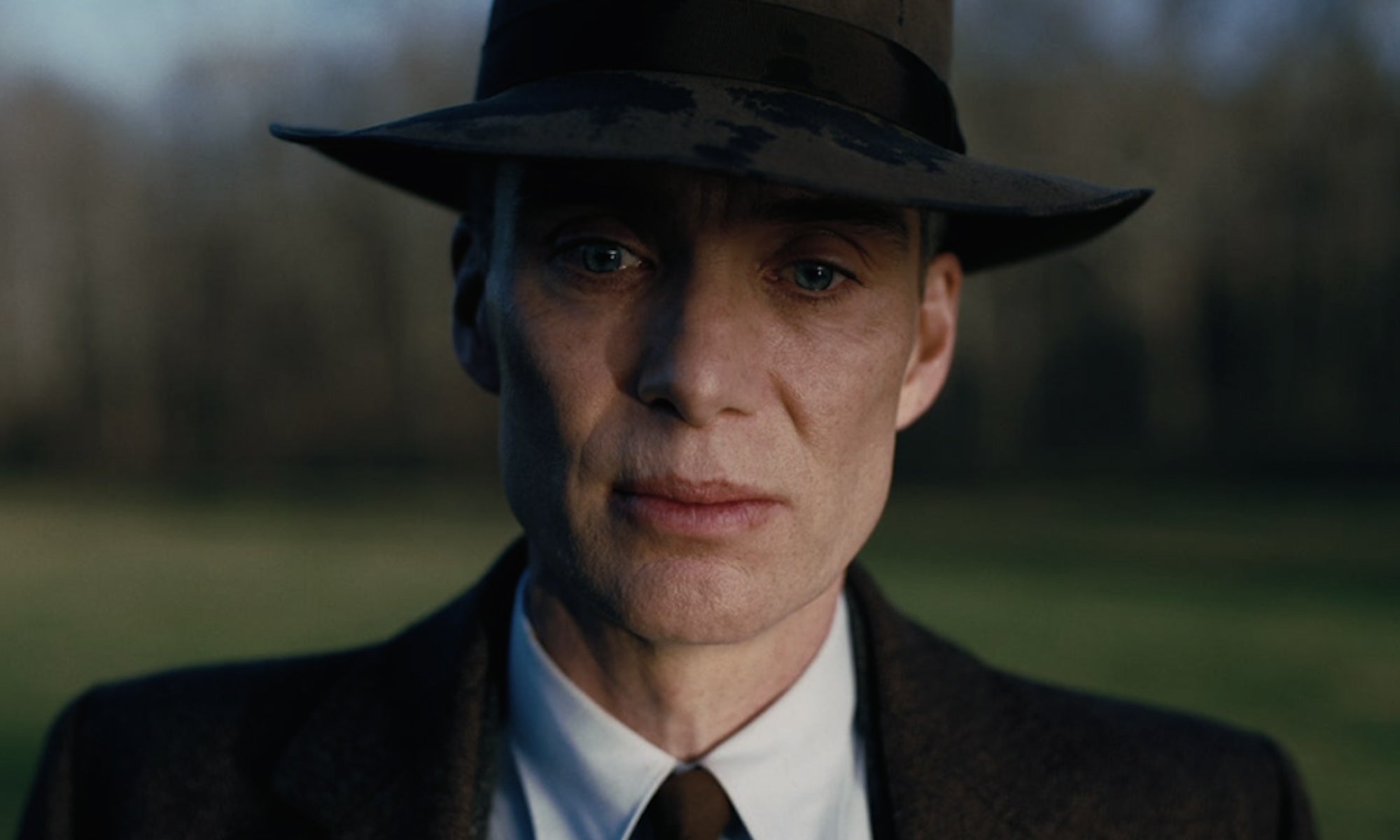
Before
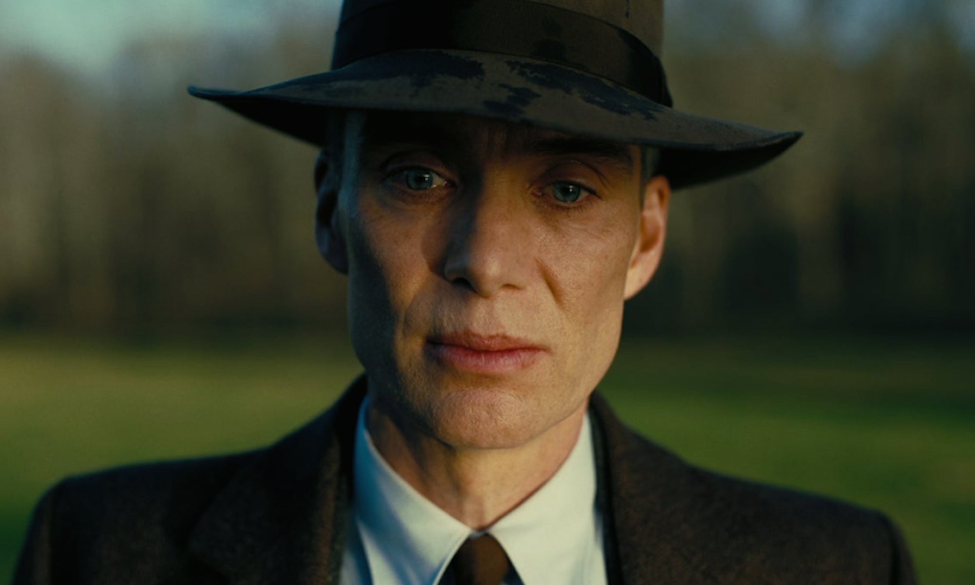
After
Inception
In Inception, the color grading plays a pivotal role in distinguishing between various dream levels and realities within the intricate narrative. The film's color grading is marked by a strategic use of warm and cool color schemes to signify different layers of the dream world. Vibrant and saturated tones are often employed to represent the vibrant and hyper-realistic dreams, while cooler and desaturated colors are used to depict the deeper, more unstable dream states.
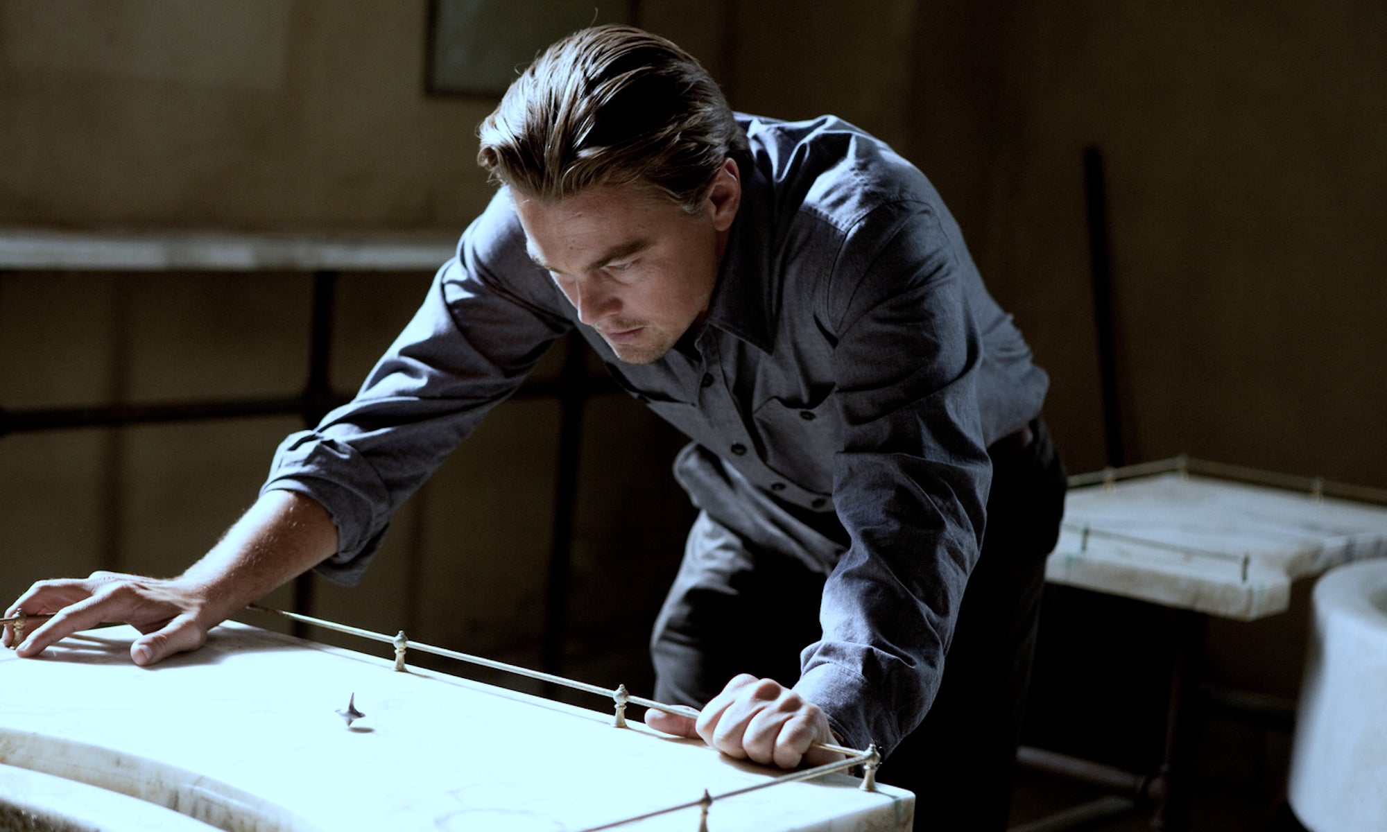
Before

After
Interstellar
In Interstellar, the color grading serves as a powerful storytelling tool, conveying the emotional and thematic elements of the narrative. The film's color palette evolves as the characters journey through space and time. Earth is depicted with a muted and desaturated look, reflecting its desolation and impending doom. In contrast, the otherworldly environments and planets are characterized by rich and vibrant colors, signifying hope and wonder.

Before

After
Dunkirk
In Dunkirk, the color grading is a testament to director Christopher Nolan's commitment to realism and historical accuracy. The film's color palette leans towards a naturalistic and documentary-style approach, with a focus on earthy, desaturated tones that reflect the grit and authenticity of the World War II setting. This deliberate choice in color grading not only immerses viewers in the harrowing and chaotic evacuation of Dunkirk but also emphasizes the raw and unfiltered nature of the events depicted.
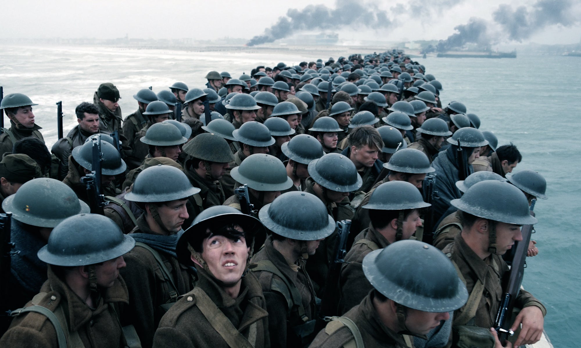
Before
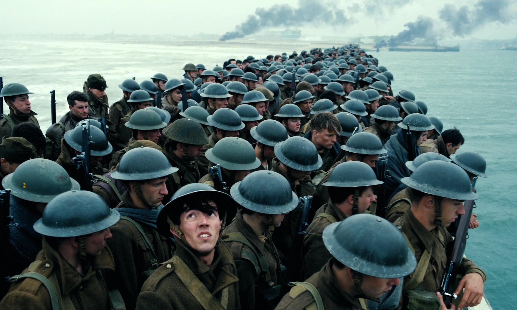
After
Este producto aún no tiene reseñas.
